Refreshing Taleo's UI with HTML5, Twitter Bootstrap and CSS3
Back in December, I wrote about what I've been working on at Taleo. Shortly after finishing up the Profile Picture, Talent Card and Org Chart features for TBE, I spent two weeks doing page speed optimization. By following Web Performance Best Practices, I was able to make the TBE application twice as fast and improve its score into the low 90s.
Next, I started working on a new project - refreshing the UI. Nick, the Lead UX Designer at Taleo (at the time), had developed a number of mockups and presented it to the developers and product folks in early November. I listened to a WebEx of that meeting and learned that everyone thought it'd take 6-9 months to complete the work. They figured they could release the new design in Q3 2012.
Since I like to provide high-value for my clients, I offered to help with the redesign and do a spike to help estimate. They agreed it'd be a good use of my time and I started working on it the week before Christmas. Since I'd used Twitter Bootstrap for my Play More! app, I recommended we use it as a foundation of the redesign. They agreed and I went to work. By the end of the week, I'd made good progress and told them I thought the redesign was possible in 2-3 months (including QA and cross-browser compatibility).
When I came back to work in January, we decided to split the redesign into two phases. Rather than moving elements around and introducing new features, we decided to do that in the 2nd phase. The 1st phase would entail simply re-skinning the existing UI, with minimal HTML changes. I spent a week refining my spike and integrating it into a branch. The next week, I switched images from individual images to CSS sprites. Next, I implemented a new theming system with different colors/icons and got everything looking good in Chrome, Safari and IE8/9.
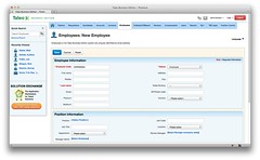
The result is something I'm quite proud of. IE8 doesn't have the rounded corners (via border-radius), but it still looks good. Forms look much better thanks to Bootstrap's styling and even jQuery UI's widgets look good thanks to jQuery UI Bootstrap. I did have to override quite a few Bootstrap styles in the process, but the result is something that doesn't look too bootstrappy.
One technique I found to be extremely useful during this process was to pair with Nick (the designer) as mentioned in Building Twitter Bootstrap. At one point, when we were trying to refine slight nuances and spacing in the UI, I paired with the Product Manager and found this to be a real time-saving effort as well.
Taleo's UI Refresh project has been a great experience for me in sharpening my CSS skills. I used quite a bit of child and sibling selectors, which work great in all the browser's we're supporting. Also, by using CSS sprites and colors (vs. images), I was able to get the manual theme-creation process down to around 15 minutes. After getting the manual process greatly reduced, I wrote a Theme Generator (based on Ant, LESS and wro4j) and got it down to mere minutes. I found Sprite Cow to be an invaluable resources for working with CSS sprites.
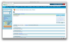
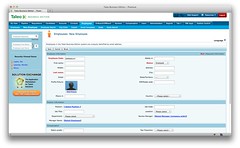
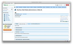
Below are some before and after shots of what we've been able to accomplish in the first quarter of this year.
I originally wrote this post at the end of January. We ran into some stumbling blocks shorty after its original composition: Nick (the designer) moved onto greener pastures and Oracle bought Taleo. What I didn't expect when I wrote this was to spend the next two months fixing slight bugs that occurred with spacing, alignment and dependent applications I didn't know about at the time. And then there was IE7. We didn't realize we needed to support it until mid-March. Then it took us around a month to make it all work good enough.
The good news is the UI Refresh was released a few months ago and seems to be humming along just fine. Sure, there were slight nuances and customizations we had conflicts with (clashing CSS classes), but overall it seems to have gone well. I can't thank the Bootstrap developers enough for motivating us to move to HTML5 and CSS3. Also, cheers to the excellent co-workers that helped make this happen: Murray Newton (Product Manager) and Vladimir Bazarsky. I couldn't have done it without you guys.
