Matt RaibleMatt Raible is a Web Developer and Java Champion. Connect with him on LinkedIn.

The Angular Mini-Book The Angular Mini-Book is a guide to getting started with Angular. You'll learn how to develop a bare-bones application, test it, and deploy it. Then you'll move on to adding Bootstrap, Angular Material, continuous integration, and authentication.

Spring Boot is a popular framework for building REST APIs. You'll learn how to integrate Angular with Spring Boot and use security best practices like HTTPS and a content security policy.

For book updates, follow @angular_book on Twitter.

The JHipster Mini-Book The JHipster Mini-Book is a guide to getting started with hip technologies today: Angular, Bootstrap, and Spring Boot. All of these frameworks are wrapped up in an easy-to-use project called JHipster.

This book shows you how to build an app with JHipster, and guides you through the plethora of tools, techniques and options you can use. Furthermore, it explains the UI and API building blocks so you understand the underpinnings of your great application.

For book updates, follow @jhipster-book on Twitter.

10+ YEARS


Over 10 years ago, I wrote my first blog post. Since then, I've authored books, had kids, traveled the world, found Trish and blogged about it all.

Studio7Designs

Andreas Viklund is the original designer of this site's layout. Last night he pointed out a cool new site that showcases another set of open source web design templates.

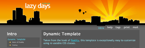
Aran and Pat, also known as open source template designers Nautica and snop, have launched a new and extremely pretty website: Studio7Designs.com. The site is announced as a "network of professional designers", and it will show off both open source website templates and stock photography. Pat is one of the designers whose work I truly admire (see the Lazy Days template to understand why) and Aran's Nautica-templates are great examples of the simple design style that I like, so the site is well worth a visit.

Like Andreas, I think their Lazy Days template is truly awesome. I wonder how hard it would be to port it to the CSS Framework?

lazy days

Posted in The Web at May 03 2006, 06:33:13 AM MDT 5 Comments
Comments:

Matt wrote (http://raibledesigns.com/page/rd?entry=rebooted#comments) "Maybe if I use the old theme's header, enlarge the fonts and put some orange everywhere, you'll like the new layout better?" So you too like the orange stuff and larger fonts, admit it!

Posted by Sanjiv Jivan on May 03, 2006 at 10:44 PM MDT #

I like the revised image and typeface in your banner. I was going to suggest mountains since you talk a lot about living in Denver. The last one really did look like a devotional page :) Regarding the CSS integration, you have made a few comments on this, but I am still confused about how it will be implemented. Will it simply be Cesidio's patch brought up to version 1.9.1? I have done some work in this direction, but when the submissions started coming in not adhering to the Stenhouse tab/class structure, you seemed to indicate something else will need to be done, but I can't find disscusson on this matter.

Posted by Bron on May 05, 2006 at 03:33 PM MDT #

Bron - it's likely the integration will be somewhat manual. There will probably be a bit of work on my part to make them work out-of-the-box with AppFuse. Also, I'll probably only modify a few of them so they work with AppFuse. As time goes on, I may modify more, but not for 1.9.2. I've already used Cesidio's patch to upgrade the SiteMesh decorator and CSS files - now I just need to add a default theme and commit it.

Posted by Matt Raible on May 05, 2006 at 08:25 PM MDT #

About Lazy Days:

  • Does not work without Javascript at all, displays blank page.
  • Does not have <noscript> section to inform that Javascript should be turned on.
  • "Intro" link does not work (well, this is not a problem of the template per se).
  • There is no meaningful minimum window witdh.
  • The graphical header is quite unrefined for professional designers: the balloons have orange border, so they look bad over the buildings; also when the window is resized to a smaller size, the left rays of the Sun got truncated, looks bad. Sun should be on the left side of the image, non-clipped.

The good thing about this layout is that it is liquid.

Posted by Michael Jouravlev on May 08, 2006 at 05:55 PM MDT #

MJour, you are so full of *SOMETHING* it's not even funny. Had you been smart enough to see that the JavaScript is related to their gallery stuff, you would have found that their template is also visible by itself (with or without javascript): http://studio7designs.com/templates/lazydays/index.cfm as well as here: http://fullahead.org/work/lazydays (latter found via google) IMHO Lazy Days is a GREAT template. Looks good and works well. You seem a little jealous, looking for issues where there are none. Typical... coming from a guy with a table-based design. John PS I am not related to the developers of LazyDays in any way

Posted by John Smythe on May 19, 2006 at 02:09 PM MDT #

Post a Comment:
  • HTML Syntax: Allowed