

How to Implement a Smart Chunking Bootstrap Carousel with AngularJS
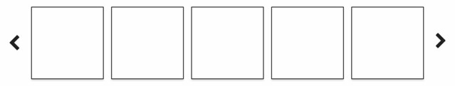
I've been helping a client develop a project management application for the last several months. One of the features I implemented uses UI Bootstrap's carousel directive to display a list of project templates to choose from when creating a new project. Rather than displaying one at a time, we wanted to display as many as the user's screen would allow. That is, if they were on a large monitor, we wanted to display five templates, a medium size monitor would display three and so on. This is a story of how I implemented a smart chunking carousel.
To begin, I made it possible to show groups of items in the carousel using array chunking.
  function chunk(arr, size) {
    var newArr = [];
    var arrayLength = arr.length;
    for (var i = 0; i < arrayLength; i += size) {
      newArr.push(arr.slice(i, i + size));
    }
    return newArr;
  }
Using UI Bootstrap's example code, I created $scope.chunkedSlides
from $scope.slides.
$scope.chunkSize = 5;

// chunk slides so there's two per chunk by default
$scope.chunkedSlides = chunk($scope.slides, $scope.chunkSize);
Next, I changed the HTML template to read the grouped slides, and show each one.
<uib-carousel active="active" interval="0" no-wrap="true">
  <uib-slide ng-repeat="row in chunkedSlides">
    <div class="row">
      <div ng-repeat="slide in row track by $index" class="slide">
        <img ng-src="{{slide.image}}">
        <div class="carousel-caption">
          <h4>Slide {{slide.id}}</h4>
          <p>{{slide.text}}</p>
        </div>
      </div>
    </div>
  </uib-slide>
</uib-carousel>
This was enough to get five squares on a large monitor.
However, I wanted to go further and reduce the number per group on smaller monitors. I created a SmartChunking
service that defined how many per group for each possible width.
angular.module('app').service('SmartChunking', function() {
  var large = 1600;
  var medium = 1200;
  var small = 1024;
  var xsmall = 800;

  this.getChunkSize = function(width) {
    var chunkSize;
    if (width >= large) {
      chunkSize = 5;
    } else if (width >= medium) {
      chunkSize = 4;
    } else if (width >= small) {
      chunkSize = 3;
    } else if (width >= xsmall) {
      chunkSize = 2;
    } else {
      chunkSize = 1;
    }
    return chunkSize;
  }
});
I wrote a smart-chunking directive to fire an event with the chunk size.
angular.module('app').directive('smartChunking', function($window, SmartChunking) {
  return {
    restrict: 'A',
    link: function($scope) {
      var w = angular.element($window);

      // window.outerWidth works on desktop, screen.height on iPad (width returns 768)
      var width = ($window.outerWidth > 0) ? $window.outerWidth : screen.height;
      var chunkSize = SmartChunking.getChunkSize(width);
      if (chunkSize !== 5) {
        $scope.$emit('change-chunk-size', chunkSize);
      }

      $scope.getWidth = function() {
        return ($window.outerWidth > 0) ? $window.outerWidth : screen.width;
      };

      $scope.$watch($scope.getWidth, function(newValue, oldValue) {
        if (newValue !== oldValue) {
          var chunkSize = SmartChunking.getChunkSize(newValue);
          $scope.$emit('change-chunk-size', chunkSize);
        }
      });

      w.bind('resize', function() {
        $scope.$apply();
      });
    }
  }
});
Then I added a listener for this in the controller that populated the carousel.
$scope.$on('change-chunk-size', function(event, data) {
  if (data !== $scope.chunkSize) {
    $scope.chunkedSlides = chunk($scope.slides, data);
    $scope.chunkSize = data;
  }
});
The final step was adding the smark-chunking directive to each slide and dynamically determining its col-sm-* class.
<div ng-repeat="slide in row track by $index" class="slide" ng-class="getSlideClass(chunkSize)" smart-chunking>
The controller contains a map of classes that map to chunk sizes:
var classMap = {
  5: 'col-sm-2',
  4: 'col-sm-3',
  3: 'col-sm-4',
  2: 'col-sm-5',
};

$scope.getSlideClass = function(chunkSize) {
  if (classMap[chunkSize]) {
    return classMap[chunkSize];
  } else {
    return 'col-sm-10';
  }
}
I did find that adding some CSS made things look quite a bit better.
.carousel-caption {
  padding-bottom: 0;
}

.carousel-control.left,
.carousel-control.right {
  background-image: none;
}

.carousel-indicators {
  display: none;
}

.carousel-inner {
  padding-left: 10%;
  overflow: visible;
}

.carousel-control .glyphicon-chevron-left,
.carousel-control .glyphicon-chevron-right {
  font-size: 100px;
  margin-top: -60px;
  font-style: normal;
  font-weight: 100;
}

.carousel-control .glyphicon-chevron-left {
  margin-left: -100px;
}

.carousel-control .glyphicon-chevron-right {
  margin-right: -40px;
}

/* make slide widths more responsive */
@media only screen and (min-width: 1600px) {
  .col-sm-2 {
    width: 18%;
  }
}

@media only screen and (min-width: 1200px) {
  .col-sm-3 {
    width: 22%;
  }
  .carousel-control .glyphicon-chevron-left {
    margin-left: -70px;
  }
  .carousel-control .glyphicon-chevron-right {
    margin-right: -20px;
  }
}

@media only screen and (max-width: 1200px) {
  .col-sm-4 {
    width: 29%;
  }
  .carousel-control .glyphicon-chevron-left {
    margin-left: -70px;
  }
  .carousel-control .glyphicon-chevron-right {
    margin-right: -20px;
  }
}

@media only screen and (max-width: 800px) {
  .col-sm-10 {
    width: 90%;
  }
}
I hope this tip helps you if you need to implement a similar feature. I've published a demo on Plunkr (best experienced in embedded view).

Posted by SmartAsh on January 23, 2018 at 01:03 AM MST #
Posted by Matt Raible on February 11, 2018 at 07:18 PM MST #