Responsive Design with CSS Media Queries
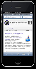
In preparation for my upcoming talk on Bootstrap and CSS3, I figured it was high time I made this blog responsive. Making my new theme mobile-friendly has been on my todo list ever since last year's redesign. I also took the opportunity to 1) remove the geolocation lookup and associated sunset logic for theme selection and 2) change the default theme to the "light" one. If you prefer dark, just click on the black rectangle in the top-right.
I started by refreshing my knowledge of media queries by reading CSS Media Queries & Using Available Space. This led me to John Hick's site, where I grabbed a couple of his rules. Most notably, I started optimizing for iPhone, smartphones and any screens less than 1000px wide. I also decided to widen things a bit for larger screens.
/* Smartphones */
@media handheld and (max-width: 480px), screen and (max-device-width: 480px), screen and (max-width: 1000px) {

}

/* Large Desktop */
@media screen and (min-width: 1200px) {

}
When I started hacking away, I noticed a lot of the elements had "width" hard-coded in pixels, so I changed a lot of these to use "max-width" instead, as well as "width: 100%". This allowed me to only have a few elements that controlled the width and I was able to take advantage of larger screens with the following simple rules.
@media screen and (min-width: 1200px) {
    #site-container, #body-content, #header-inner {
        max-width: 1170px;
    }

    #body-content #left-column, .next-previous {
        max-width: 808px;
    }
}
For smartphones, I started by hiding the right column and menus with display: none. Then I decided the navigation menu might be useful if I ever wanted to manage the site on my phone. I found Create an Absolute Basic Mobile CSS Responsive Navigation Menu from the treehouse blog and went to work. 20 minutes later, I had the menu I was looking for and everything was looking pretty good in iOS Simulator.
At this point, I discovered that rotating to landscape mode caused the content font to become quite a bit larger. So I added a rule for the iPhone in landscape mode.
/* iPhone Landscape */
@media screen and (min-width: 321px) and (max-width: 480px) and (orientation: landscape) {
    #body-content #left-column .article .contents {
        font-size: 9px;
    }
}
I'm still not sure why this happens. I also noticed that rotating back to portrait causes some empty whitespace to show up on the right. The empty whitespace was a problem I spent most of my time solving. I ended up using web inspector with iOS Simulator to figure out which elements were bleeding past my desired width and then adjusted their width, or used overflow: hidden to hide them.
I enjoyed this mobile design experience, even with the many "why is there whitespace there!" moments. I especially liked it when I found I didn't need any rules for the iPad. I'm sure there's a few issues that still exist. For example, I haven't tested it on an Android device. Also, the Facebook button's "color-scheme" is still hard-coded in my templates. I hope to fix this by patching Roller to allow reading cookies on the server-side. If you notice anything that looks funny, please let me know.
In the meantime, I hope you enjoy squishing and stretching your modern browser to see how this new responsive design works.


It's a nice start to media queries, but you should be using EMs instead of PX:
EM Media Queries
Posted by Martin Laritz on April 12, 2013 at 03:16 PM MDT #
Posted by Matt Raible on April 12, 2013 at 03:19 PM MDT #
Posted by mjordan on December 28, 2013 at 05:51 PM MST #